5 Important UI Design Choices
UI design is about making smart, intuitive choices that streamline the use of applications and websites. The proper use of icons, buttons, and design choices to elicit responses and actions that developers want.
Proper UI design makes things easier for users. It takes the actions of how users interact with interface screens and create layouts that assist users in the most natural route to doing a preferred action. Here are five UI design choices you need to make for a proper user interface.
Clarity of Icons/Elements
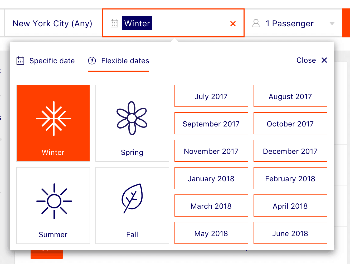
Icons and elements must have a clear meaning in UI design. When it comes to proper UI design, icons and elements must lead people in the right direction. Here is an image from DoHop, a travel app:

When selecting a time you want to travel, there are clear month icons, but a more general selection of which season you’d like to travel. Each element is well labeled and defined with proper images. When someone sees a sun, a snowflake, a flower, and a leaf, they can easily visualize the separation of each respective season.
Clarity like DoHop’s travel app is vital in UI design choices. The user needs clear imagery and understanding of what each element means and represents in your design choice. Proper clarify in UI design leads a user to interact with each component.
UI Design Needs Appropriate Preferred Actions
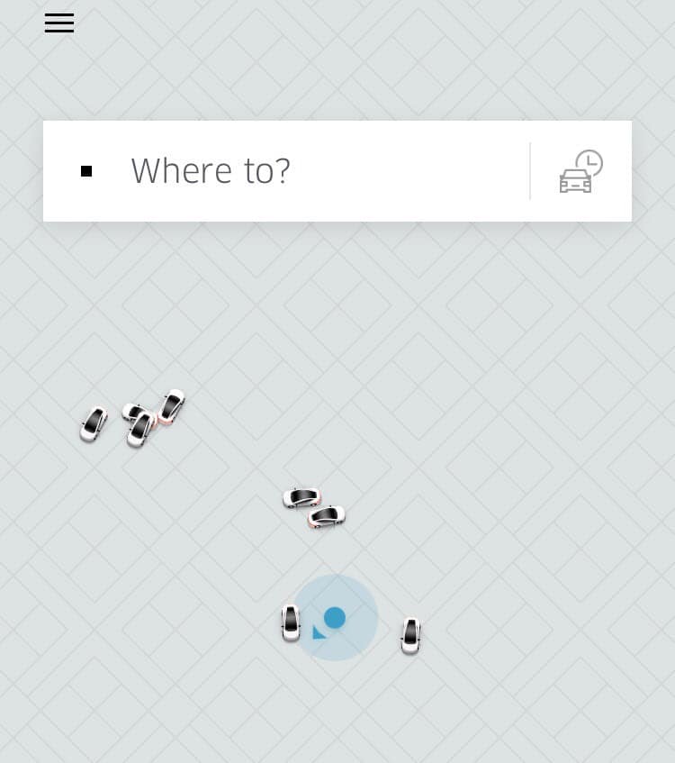
In UI design, a preferred action is a step that the developer wants a user to take. Look at the Uber app for example:

When you load the app, centered up top is a box that asks “where to?” The app explicitly lets you know the preferred action is to type in the location/address you would like to take your Uber to.
This is proper UI design because it does not leave the user of the app guessing on what to do or where to go. The user immediately understands where to type in their desired location and how to get their ride.
Never leave the user guessing on their next action, use proper UI design and offer them the next step easier.
Keep The Interface Contextual
When designing, keep the interface contextually accurate. When you view your notifications on Facebook, you can visit the post the notification came from by clicking the specific notification. This is proper UI design contextually because it follows a contextual line of events to see the specific notifications.
When someone is on a page or within a box, they can assume through context that they can interact with everything necessary in that area. If you entered notifications on Facebook but had to access the function to view the notifications elsewhere, it would not line up contextually. Keep your UI design consistent and contextual.

Default Settings Matter
Every app or program has default settings. Proper UI design means you must make the default settings the ones that make the most sense to achieve clarity, preferred action, and context.
Most people will never change the default settings if they work well. Think about your cell phone or television. How often do you change the settings available? Most users keep the default settings. Proper UI design is about finding the settings most people would prefer to keep.
Make Complex Actions Simple
When it comes to UI, it’s all about making complex actions simple. A user does not want to click through multiple links to get to the same page they could have in one link. Create simple, streamlined actions to navigate and use your applications.
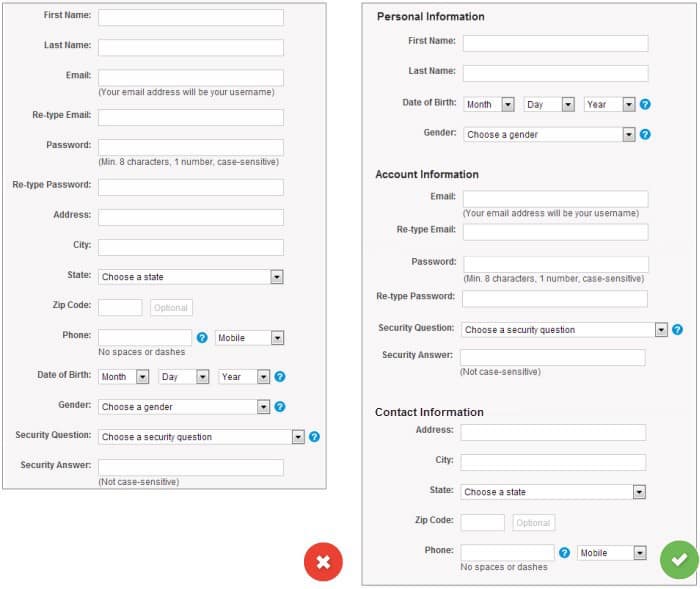
Keeping complex actions simple in UI design goes especially for forms. Look at the side by side of these two forms:

On the left side, the form is a giant block of text. There is no method to separating the design. On the right, the sections have proper titles. This makes the form feel less complex. It creates easily digestible parts.
An even better UI design for forms is to keep each section on its page and show the progress a user makes as they complete each section.
When a user has small, digestible sections and simple actions, they better understand how to interact with the interface.
UI design is important to get correct. No matter how useful an application, or how great looking a website is, the interface must be accessible for users to enjoy their experience.


