Since the launch of the iPhone in 2007, mobile devices have become much more commonplace, especially when it comes to internet usage. Each year, web traffic from mobile devices has increased, and in a study by Statista, phones eclipsed desktop computers in web traffic in 2018. Mobile users have officially become the majority of website surfers.
If half of all web traffic comes from mobile devices, shouldn’t you have a mobile-friendly website? The answer is obvious: yes! Mobile isn’t a fad; it seems quite permanent in our technological landscape. If your website isn’t mobile-friendly, then each year you’re upsetting more and more of your users. That’s definitely not good!
We’ll provide you some tips and tricks to look out for so that your mobile users are getting as much from your website as your desktop users.
Utilize Responsive Themes

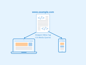
Each mobile device has a different size. It’s important that your mobile site is able to conform to different sizes as well. Responsive themes are ones that are able to change as the size of the screen changes. These formats conform to the screen they’re being viewed on in a user-friendly way.
If you build your website with only one or two specific screen sizes in mind, it will load and look odd on anything but those two sizes. Adding responsive themes to your website will allow it to look crisp and clean on any sized device. And a responsive design will create more positively responsive mobile users.
Clearly Display CTA’s
While having clear call-to-actions (CTA) is a given for any page, they need to be displayed more prominently on a mobile site. What are you wanting the mobile user to do when they reach a certain page? While on a PC the user might use more dwell time to scan through the page, most mobile users are looking for quick and simple.
The smaller screen on a mobile device means a more focused view of your website, which means you don’t want them missing out on any CTAs. Creating clear and simple CTAs that stand out from the rest of the text and images on the screen can help guide visitors to the right information and links, which could improve your Click-Through Rate (CTR).
Size Matters
When scrolling through a website on a desktop, it’s easy to pinpoint a specific link, button, text, or prompt with the mouse pointer.
Mobile users aren’t so lucky.
Their fingers do all the talking, which means that any buttons or links you might want users to click on must be larger and easily tap-able. If not, users will be trying to tap the screen endlessly for the few small pixels they want to access. This might make them look for that content elsewhere if the entire UI looks like that.
Small sized executables can occur on mobile especially if a desktop website is the exact same on mobile but just shrunk to fit the screen (just another reason to utilize responsive themes!) Ensuring that clickables are easily clickable is an important step in developing a website with mobile in mind.
Eliminate Fussy Popups (Or Really Clean Them Up)
 Part of the precision of a mouse curser involves dealing with pesky popups. Oftentimes popups have small close icons surrounded by a field of executables just waiting to open a new tab or provide users a form to fill out. On mobile, that small popup is now the entire screen. And many popups can only be closed if you click off screen, which doesn’t help when your popup IS the entire screen!
As a rule, it’s best to try and avoid popups on mobile sites. Mobile users tend to be looking for quick information, and a popup will most likely just get in their way. That might break their ability to use your site, which will almost definitely cause them to search somewhere else.
Accidentally clicking popup ads and being pulled to a different landing page or an app store to download something isn’t fun at all.
Usability issues tend to be pretty frequent with popups, so if you are utilizing them in your mobile site, make sure they’re extra mobile friendly: quick load times, easy exit prompts, and a very clear CTA. Make extra sure your popups are optimized for mobile use.
Improve Load Times
Research performed by Google into load times shows that the average landing page requires 22 seconds to load on mobile devices, but 53% of mobile users will leave a website’s page if the load time is longer than 3 seconds. Load time seems to be even more important to mobile users than desktop users. This means optimizing your mobile sites for better load times is important, not just for your SEO score, but for your CTR and dwell times on mobile device users.
 How can you improve load times? You can start by compressing images. A lot of extra data can be shaved by compressing images down without losing most of their quality. As well, limiting the text and space of a page can help any site load faster. Using more streamlined options can help too.
Maybe instead of embedding a whole video into your webpage you embed a YouTube plugin that actively streams the video, but only once the video’s started to load. Compressing the images on a carousel could save you whole seconds of load time. And the quicker the load time, the more likely mobile users stay on your site.
Bottom line: load times are a common issue for mobile users, and they should be a data point you’re constantly looking to improve when creating a positive mobile experience.
Optimize Text
A wall of text is intimidating, even on a desktop’s monitor screen. When that wall of text is the entire screen? No, thank you.
The visual flow of your text is almost as important as the text itself. How you format and place the text helps with comprehension and flow. Making sure that your mobile users don’t feel overwhelmed with huge blocks of text might help them keep reading on. Shorter sentences and 3-4 sentence paragraphs are the best way to go.
Use SEO Tools
 There are some great SEO tools that provide simple tests of websites to check for usability, especially for mobile rankings. These tools, such as SEMRush and Ahrefs, can provide comprehensive insight into your website’s performance. While it won’t exactly tell you every time what you need to do, it will allow you to make more informed design decisions.
PageSpeed Insights is another great (and free) tool to check up on your website’s load time. It even provides data for both desktop and mobile platforms, so you know how each option is performing in comparison.
Pick A Good Font
The font your text is written is is also an important detail in terms of readability.
San serif fonts are best for mobile devices. They lack the decorative strokes that a serif font has, which can make blocks of smaller text look cluttered and harder to read. Mobile-friendly websites are easily readable, and finding the right font for both your site’s design and the user’s eyes will improve the readability of your website.
What font will both go well with the theme of your website and for readability? Oftentimes this is pretty subjective, so it’s best to have some friends on hand to try out any font changes you make. Working with a designer on developing a consistent brand style can also be helpful when it comes to choosing the right fonts.
Conclusion: Go Mobile!
Mobile-friendly websites aren’t a fad that will fade in popularity. Over the past decade, more and more data is being streamed through our phones, tablets, and watches. Being responsive to technology shifts is as important as ever, so implementing things like a responsive design and improved load time will only increase user-friendliness as more and more of your users shift to mobile viewing.
Drift2 Solutions specializes in responding to tech trends and ensuring that your website’s design is based on tested and researched technology trends. Let us build your next website!


